Blocks
Heroes & Media
The image-led blocks: heroes, full-bleed imagery, carousels and tiled galleries.
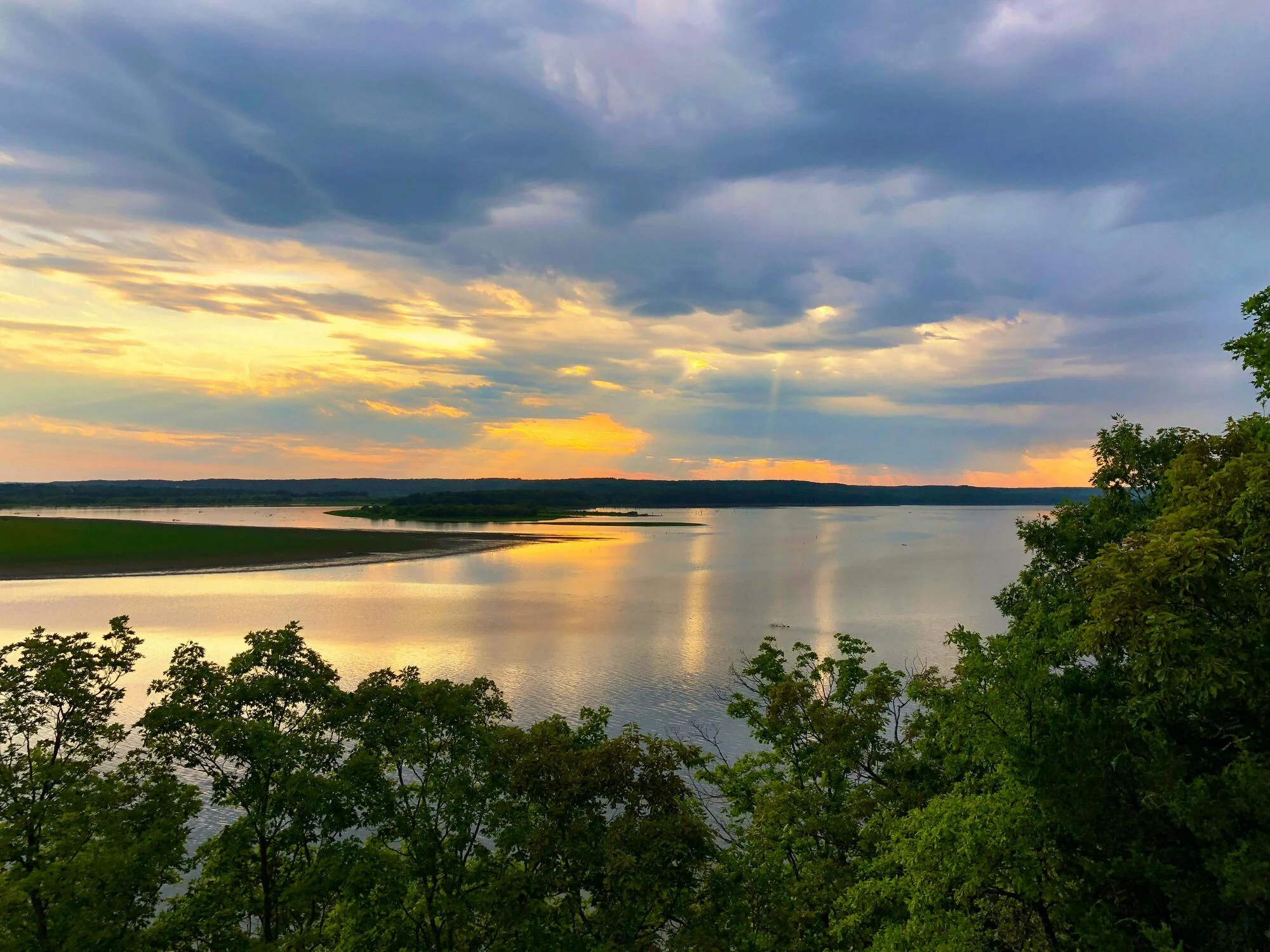
This page is the heroes and media family. It opens with the secondary hero you are looking at, then shows the default full-height hero, a full-width image, the dynamic image in its three overlay positions, the fraction-paginated image carousel and the three mosaic row types.
Hero
The default hero.
Full viewport height, content anchored to the bottom, scroll indicator on. Image or video background with a focal point picker.
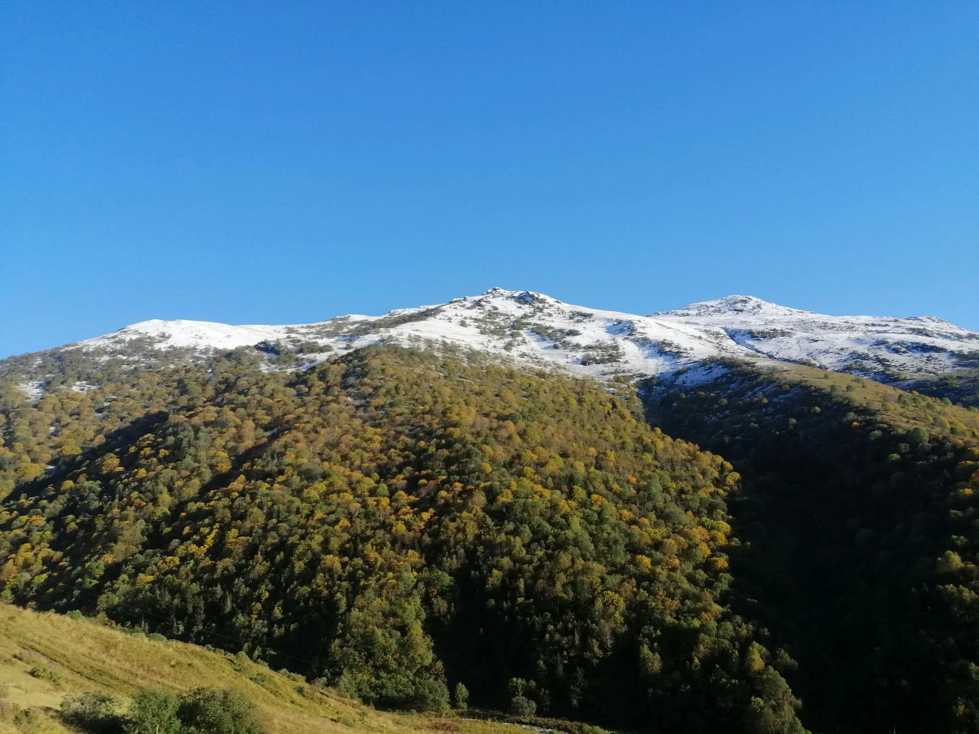
A landmark stay, restored.
Original brickwork, modern comforts, and a rooftop that earns the climb.
Full-width image
Edge to edge.
A single image (or looping MP4) that spans the viewport. No text, no overlay — a pause between sections.
Dynamic image
Widescreen, with an optional message.
A 21:9 image or click-to-play video. Content can sit centred or bottom-left over a tunable scrim, or be left off entirely.
Everything past the keys.
Dining, wellness and the city itself — arranged before you arrive.
The east wing
Twelve suites above the courtyard, with the morning sun on two sides.
Image carousel
Swipe through a gallery.
Swiper-driven, fraction pagination, honours the test-mode freeze and reduced motion.
Mosaic
Tiled galleries with three row types.
Featured (one large, two small), split (two columns at 5-7 or 4-8, optionally reversed) and single. Each tile is an image card: overlay caption, caption bar, or plain image.
The spaces